

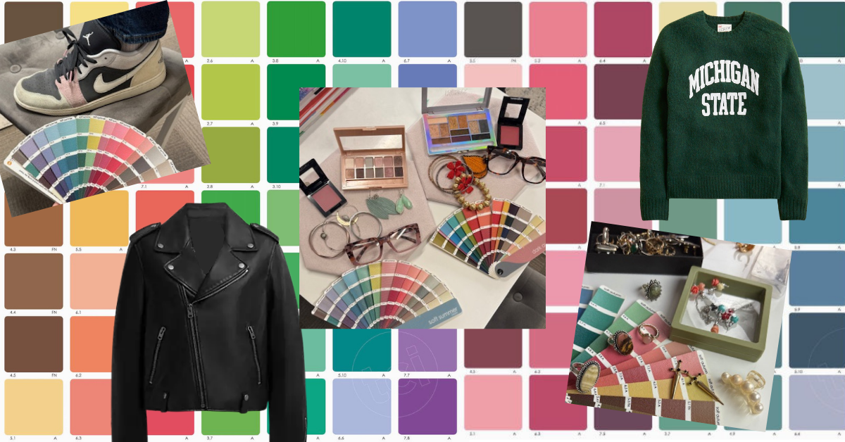
Beyond Color: Why Personal Style Analysis Is the Missing Piece in Your Wardrobe
Color analysis is transformative, but it's only one piece of the puzzle. Knowing your best colors can make you look radiant — but true confidence comes when your clothing also reflects who you are, supports how you actually live, and honors your natural shape. In this post, we're going beyond the color drape to explore why personal style analysis is the missing piece so many women need to finally feel at home in their wardrobes.
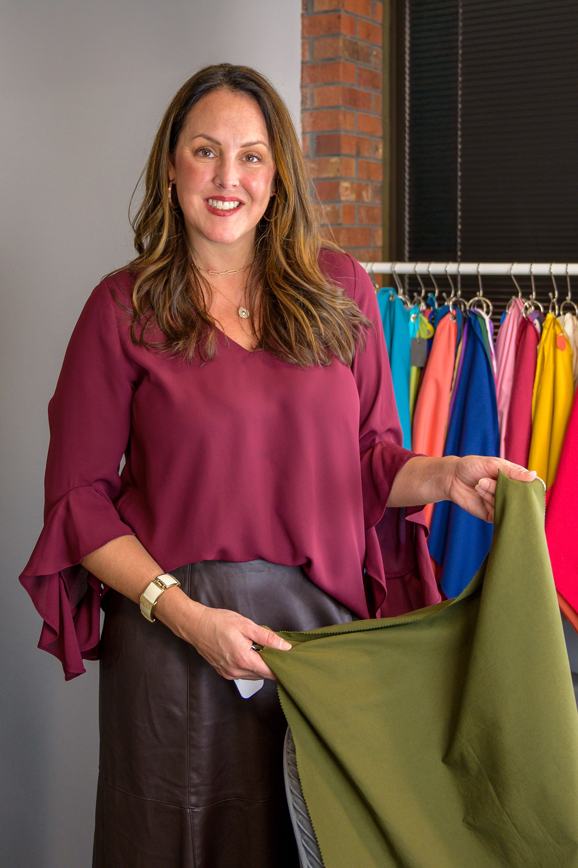
By: Renee Pawloski
One of the most common things I hear after a personal color analysis is:
“I finally know my colors… but I still don’t know what to wear.”
If this is you, you are not alone! Color analysis is transformative, but it’s only one piece of personal style. Wearing your best colors can make you look radiant, but true confidence comes when your clothing also reflects who you are, supports how you live, and honors your natural shape. I have heard so many clients ask if I help with style analysis that I decided to take a deep dive and educate myself on personal style. I took a Fashion Styling certificate course through the Fashion Institute of Technology, trained in a second fashion style course through a color consultant colleague and have read over a dozen books (and counting) on fashion, style and dress. That’s why I’m so excited to offer personal style workshops—helping clients go beyond color to build wardrobes that feel intentional, authentic, and beautifully aligned from head to toe.
The COVID-19 pandemic had a huge impact on how we dress. Global lockdowns and work-from-home mandates shifted consumers' fashion choices. Comfort dressing became the norm, shifting to casual loungewear, leggings, fabrics with stretch. "Zoom fashion" emerged, with people focused on wearing elevated tops and accessories while bottoms remained casual.
When offices reopened, it was clear COVID dressing had a lasting impact as many workplaces permanently adopted “smart casual” or hybrid dress codes, abandoning formal office wear, high heels and typical corporate dress. Stiff, structured suiting gave way to more softly tailored pieces. Elevated basics (think a t-shirt with a soft blazer) and more comfortable footwear has become mainstream, clear signals that companies (and the collective public) now value physical comfort over strict formality. Many jobs have remained remote. For those folks working-from-home, they miss what I call the “water cooler” fashion show, or put more plainly - they don’t see others on a daily basis and therefore aren’t able to draw inspiration or ideas from coworker’s outfits. In addition, we are attending social events less often than any other time in history. Studies show Americans are spending half the time hosting or attending parties than they did in 2003. With social events fewer and further between, I hear clients often say they have plenty of casual pieces, but their “going out” wardrobe for date nights, social gatherings, their yearly work conferences or the rare formal event is severely lacking.
All of this is to say that many of us have lost our style identity (if we ever had one) through no fault of our own. Add to this weight loss/weight gain/menopause body changes, and many people are at a total loss how to rebuild their wardrobes. Honing your personal style isn’t about dressing like someone else, it’s about becoming more fully yourself.
Style Should Feel Like Recognition, Not Performance or Copy/Paste
Many women have spent years dressing for trends, to meet other people’s expectations, to please their partner, for their “fantasy self” or in what they think they should wear based on their age, size, culture, geographical location or based on what store windows are showcasing. As examples, I know shopping strategy is to purchase the head to toe look she sees on mannequins in her favorite department store, without taking into consideration whether the outfit is right for her shape (often it is not). For several years, I kept buying blazers, however, I just don’t have many occasions to wear them with my current lifestyle.
Without doing the work to figure out your personal style, get real about the clothing your lifestyle calls for and figure out how to work with the shapes of your body architecture, the result can be a closet full of clothing that technically fits—but doesn’t connect to you emotionally. You may have pieces that are beautiful, expensive, or fashionable, yet still feel strangely disconnected from who you are. Real style should feel like recognition. You should put something on and think “There I am.” You should see something you love and think “This is SO me!”
Dressing With Intention Changes Everything
When you understand your personal style, getting dressed moves from being reactive and depressing to purposeful and joyful.
Instead of buying random pieces because they’re trendy or on sale, you can hone in on specific aspects to make a more informed purchase for clothing you will actually wear:
Does this reflect my personality?
Does this support the life I actually live?
Do I feel confident and comfortable in this?
Does this align with my natural lines and proportions?
Intentional dressing creates consistency. Not the kind of consistency that is boring, but the kind that is grounded in really being intentional with what no longer serves you and making choices aligned with where you are now. The result is that your wardrobe feels effortless, mixes & matches seamlessly and tells a cohesive story about you.
Authentic Style Looks Different on Everyone
One of the most freeing parts of style analysis is realizing there is no single definition of “good style.” Style is personal, style is expressive, style is individual. Style that is authentic will look different for each individual. When examining when they feel their best, most people find they feel most themselves when prioritizing one aspect of style over others:
Relaxed, natural silhouettes
Romantic details and softness
Tailored, polished structure
Creative, artistic combinations
Dramatic statement pieces
Minimal, understated elegance
None of these approaches to style are better than the others. The goal is not to transform yourself into someone else’s aesthetic. The goal is to identify what already resonates with you.
When your clothing reflects your authentic essence, people notice—not because the outfit is louder, but because you feel more present in it. Presence leads to more confidence. We have all had that experience where we copied a look we saw on others, only to have it fall short when we tried it ourselves. That was likely the result of having a different personal style.
Honoring Your Body Shape Isn’t About Hiding
Body shape analysis is often misunderstood. It is not about fixing your body, disguising yourself, or following rigid fashion “rules”. Honoring your body shape is about understanding proportion, balance, and visual harmony. Every body shape has beautiful features worth highlighting. Learning how to dress the lines of your body allows you to choose the right silhouettes. Wearing the right silhouettes can have wonderful outcomes:
Create balance
Enhance natural curves or structure
Elongate proportions
Improve garment fit
Help clothing drape more naturally
When clothing works with your body instead of against it, you stop constantly adjusting, tugging, hiding, or feeling uncomfortable. Wearing silhouettes that work allow you to move through the world with greater ease.
Color + Style + Shape = A Fully Aligned Wardrobe
This is where the magic really happens. When you combine your most harmonious colors, most authentic styles, and most flattering silhouettes, your wardrobe becomes incredibly functional and empowering.
Knowledge is power, intention is action. When you know your best colors, styles and shapes, shopping becomes easier, outfits come together faster, impulse purchases decrease and confidence increases.
And perhaps most importantly—you begin to trust yourself more.
Personal Style Is Self-Expression, Not Perfection
The fashion industry often tells women they need to become “better” versions of themselves before they deserve to feel stylish. I believe the opposite. Style is not about earning worthiness, it’s about expressing identity.
You do not need to shrink yourself, reinvent yourself, or chase every trend to be stylish. You simply need clothing that supports who you already are, exactly where you are right now. Whether you are living in your stay-at-home-mom era, your hard charging corporate boss babe era or your retired mumu-wearing mahjong-playing era, you deserve to feel confident when you get dressed. That confidence begins with a wardrobe that supports YOU.
What to Expect From Personal Style Analysis Classes
These classes are designed to help you discover:
Your authentic style direction
How to dress intentionally for your lifestyle
Which silhouettes best support your body shape
How to create outfit harmony
Why certain pieces feel “off” even in your best colors
How to shop more strategically and confidently
Think of it as building a wardrobe with clarity instead of confusion.
Because once you understand yourself, style becomes far less overwhelming—and far more enjoyable.
The Goal Isn’t More Clothes. It’s More Alignment.
A truly successful wardrobe is not the trendiest one, it’s the one that helps you feel comfortable, confident, recognizable, and fully yourself.
Color analysis is one step. Personal style analysis can help bring the full picture together.
There is something incredibly powerful about getting dressed each day in a way that feels intentional, authentic, and aligned with the person you truly are. That is my hope for each and every client I have the privilege to work with!
Color Analysis Myths — Debunked
Think knowing your color season means following a strict set of rules? It doesn't. As a certified 12 tone color analyst, I'm breaking down the six biggest myths I hear from clients — and replacing them with the truth about what your palette can actually do for you.
By: Renee Pawloski
What your color season actually means — and what it absolutely doesn't
As a certified personal color analyst with True Colour International, the questions I hear most often aren't often about color — they're about fear of getting it wrong. Color analysis has taken on a life of its own online, and with that comes a lot of noise, rigidity, and misinformation. While TikTok and Instagram have been instrumental in introducing the concept of color analysis to the world, some of the content does the process, integrity and application of it a disservice. Let's clear the air.
Myth #1: "I Have to Wear Only My Season's Colors."
This is the myth I hear most — and the one that causes the most unnecessary anxiety. Your personal color palette is a tool, not a rule. It is a compass, not a cage. Your palette tells you the colors with the right undertones, depth (value) and chroma (lightness to brightness) that will make your skin glow and your eyes pop. What it doesn't do is ban you from wearing anything outside that palette. You get to decide how heavy of a hand or light of a touch you apply your palette to your color choices. If you love fuschia, but it is not in your pallete-wear it with joy! Costume parties, sporting events, theme nights, and full-on style experiments exist outside the rules — and they should. A black leather jacket is iconic for a reason -wear it if that is your vibe or if that is what is called for for the occasion.
✦ Quick Tip: When dressing for everyday life, let the colors in your palette guide your face-framing pieces — shirts, glasses, hats, scarves, and jewelry.
Myth #2: "Color Analysis Is Just Four Seasons."
The original four-season model of the 1980’s — Spring, Summer, Autumn, Winter — was revolutionary for its time. But color is nuanced, and so are people. The 12 tone system expands those categories into a much more precise framework that scientifically accounts for the hue, value, and chroma variations that make each of the 8.3 billion on the planet unique. The 12 tone system allow space for neutral undertones. We find that 2/3 of people end up a neutral season, and only 1/3 end up with a true season result. If you were analyzed in a four season system and been told you're a "Winter" but something felt off, there's a good chance you could be one of the neutral winters or even perhaps a different season entirely. Each of the 12 TCI tones has its own distinct palette of colors.
✦ Quick Fact: The 12 tone system includes 3 seasons within each of the four original seasons. Bright Winter and Dark Winter round out the Winter lineup along with True Winter. Our Summer seasons are True Summer, Soft Summer, and Light Summer. Spring options are True Spring, Light Spring, and Bright Spring, and Autumn comes in with the trio of True Autumn, Dark Autumn and Soft Autumn.
Myth #3: "My Skin Tone ALONE Determines My Season."
Skin tone is one data point we look at during your color analysis session, but it is not the whole picture. True color analysis looks at the relationship between your skin, eyes, and hair together. Your natural skin color, natural hair color, and natural eye color are all in perfect harmony and meant to go together. Two people with similar skin tones can be different seasons. We look at how colors interact with your overall natural coloring — a concept called harmony to determine your seasonal tone. This is why online color analysis quizzes or AI applications often miss the mark - they assess skin tone in isolation rather than evaluating the full picture through calibrated draping. Photos don’t render color reliably enough to make an accurate color palette determination.
✦ Quick Fact: Draping — holding fabric swatches near your face in full spectrum lighting — remains the most accurate tool for determining your season, because it reveals how color either harmonizes or clashes with your unique coloring in real life.
Myth #4: "Color Analysis Is Only About Clothing."
Can’t live without your straightener or leave home without your favorite lip gloss? Meet your new bestie - your personal color palette fandeck is one of the most versatile personal appearance tools you own. Once you know your season, you can use it to help with choosing hair color, cosmetic, accessory metals (gold vs. silver vs. rose gold), leather goods, the backgrounds in your branding photos, and even the colors you choose for your home office walls so you look your best on those Zoom calls. I once helped a client who was an actress choose a paint color for the walls in her home studio where she films her audition videos. We pulled a color directly from her True Summer palette, knowing it would highlight her beautifully, really making her skin glow and beautiful blue eyes shine. Knowing your season doesn't just simplify getting dressed — it simplifies every visual decision you make allowing you to confidently and quickly make the best choices to showcase your unique coloring.
✦ Quick Tip: Before your next branding or headshot session or before your next family photo appointment, consult your palette for outfit colors, lip color shades, and backdrop tones. Leveraging the power of color makes the difference on camera striking.
Myth #5: "My Season Will Change as I Age."
Your seasonal tone is determined by the fixed relationship between your natural coloring characteristics — undertones, value/contrast level, and chroma level. These don't fundamentally change as you age, even as your hair grays. What may change is how you apply your palette. Everyone’s hair eventually lightens and grays, but a Soft Summer’s soft silver hair will look different than than of a True Autumn’s more warm gray hair. The Soft Summer might lean into lighter, cooler shades within their palette, but the season itself will stay the same. A great example of the same colors working throughout one’s lifetime lies with Elizabeth Taylor. As a young starlet, she had striking black hair, bright glowing skin and striking jewel toned eyes. She looked great in bright chroma cooler jewel toned colors. As she went gray, her hair still maintained a striking salt-and-pepper, and even when she was all white, hers was a bright and high contrast white, still allowing her to rock those bright jewel tones.
✦ Quick Tip: Many people feel unmoored when they hair turns gray. If your hair has grayed and you feel different, you may consider trying colors in your palette you haven’t tried before to find some new favorites to help you work confidently with your mature hair color.
Myth #6: "Black and White Work for Everyone."
This is perhaps the most widely believed myth in fashion — and one that color analysis directly challenges. Pure white and pure black are colors found in True Winter, with their cool undertones and bright chroma, and they are not flattering on everyone. Pure black can create harsh shadows on lighter, softer seasons, making them look tired and drawn. It can also wash out warmer seasons. Bright white can overwhelm muted or deep coloring rather than complement it, causing a loss of jawline or cheekbone definition. That doesn't mean you can't wear black or white, it just means you may have different versions that are more flattering for you. It means knowing which black — soft black, dark charcoal, warm blue-black — and which white — warm ivory, cream, bright white — works best for your unique season.
✦ Quick Tip: Warm seasons often glow in their versions of off-white, cream, vanilla or ivory. Cool seasons tend to shine in their versions of crisp white, eggshell or soft pearl white. Try both near your face in natural light and see the difference for yourself.
Your palette is a gift — not a limitation.
Understanding your personal colors should feel freeing. Scientists estimate the average person can distinguish about 1,000 levels of light-dark, 100 levels of red-green, and 100 levels of yellow-blue, resulting in roughly 10 million unique colors. With so many colors as options, knowing your best colors takes the guesswork out. Your personal color palette is really the ultimate cheat code - like finally having a guide that makes every decision easier, more intentional, and more authentically you.
Warmly,
Renee
TCI Certified Personal Color Analyst in Denver, Colorado
Spring Clean Your Closet through the lens of your Color Palette
Spring cleaning your closet hits differently when you know your personal color palette. A certified 12 tone color analyst walks you through using your personal color palette as the ultimate edit tool — clearing out what dulls you and uncovering the hidden gems already hanging in your closet. Less clutter, more color, and a wardrobe that finally feels like you.
By: Renee Pawloski
As the seasons shift and the days grow longer, many of us feel the urge to spruce up our homes, purge unused items, and refresh our wardrobes. Spring cleaning isn’t just about organizing drawers or donating pieces you no longer wear—it’s an opportunity to reconnect with yourself in a way that feels intentional, effortless, and authentically you.
As a personal color analyst, I often tell clients that the most transformative closet makeover or style refresh starts with understanding your colors and sometimes that also encompasses connecting to what no longer serves you. Spring is the perfect season to examine your closet in preparation to lean fully into your 12-tone palette for the summer.
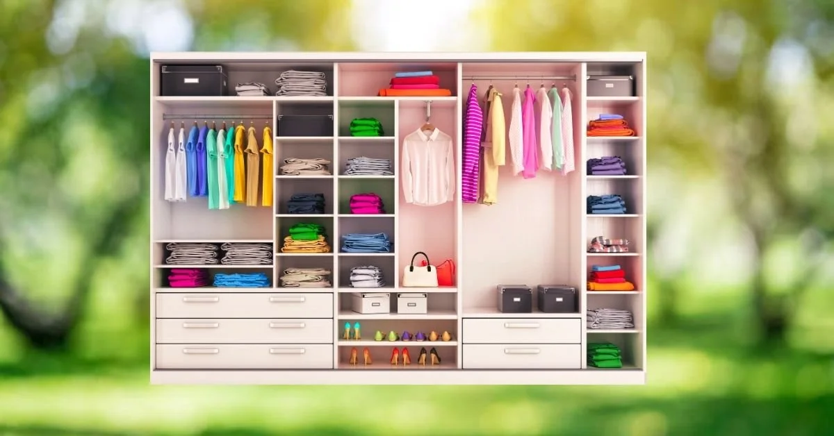
Why We Wear the Same 20% of Our Closet
Most people only wear a fraction of the clothes hanging in their closet. Why? Because even if we can’t articulate it, we all have pieces that just don't work. The pieces that sit untouched in your closet are often problematic in one way or another:
They are the wrong undertone, too muted or too bright or too dark or too light for your coloring
They make you look tired, dull, or make your skin look uneven
They are the wrong fit for your body shape
They don’t match your style vibe
When your wardrobe isn’t aligned with your personal coloring or personal style, getting dressed can feel frustrating or like you have nothing to wear—even when your closet is bursting at the seams or is seemingly full of options. That’s where knowing which of the 12 tones contains your best colors can change everything.
Your Best Colors Highlight You And Create Ease
Whether you’re a Light Spring, Soft Summer, Dark Autumn, Bright Winter, or another tone within True Colour International’s 12-tone system, your palette is designed to harmonize with your natural features.
Simply put, when you wear your correct colors, you look your best and simplify your routine:
Your skin appears clearer and more radiant
Your eyes look brighter
Fine lines soften and discoloration is lessened
Your jawline and cheekbones look more defined
You look polished with less makeup and effort
Mixing and matching clothing becomes dramatically easier
Packing for summer vacations is a breeze
Your palette becomes the foundation for a wardrobe that actually works together.
Spring Cleaning Through a Color Analysis Lens
Before you begin shopping for spring or summer trends, start by editing your current wardrobe with intention, specifically putting color consideration at the forefront.
Step 1: Pull Everything Out
Yes—everything.
Seeing your clothing together allows you to notice patterns:
Are most of your unworn pieces in colors outside your palette?
Do certain shades consistently make you feel “off”?
Do pieces in certain colors just feel effortless?
Are there pieces you love that aren’t quite in your color palette?
Are you buying trends instead of harmony?
Go easy on yourself. This process isn’t about judgment of past purchases or feeling guilty you have pieces with tags still attached. It’s about gaining clarity around reasons why you are attracted to purchase certain things, why you wear some things more than others, and where you may be making mistakes. Learning these answers can help you pivot to making more informed and intentional decisions on pieces that will serve you better in the future.
Step 2: Sort by Color Energy into “Heck Yeses” and “Heck Nos”
As you review each piece, examine it in the context of its color:
Does this color make me look vibrant or drained?
Do I feel confident wearing this?
Does it work with the rest of my wardrobe?
You’ll often notice your best pieces naturally align with your season’s characteristic three dimensions of color. Thus they will share the same hue (warm, neutral or cool), value (lightness to darkness) and chroma level (softness to brightness) as your personal color palette.
Make a pile of “heck yes” items that are clearly in your palette and that make you feel radiant and confident when you wear them. Make a pile of “heck no” items that just don’t support you that you are ready to let go now that you know the power of wearing your best colors has on your appearance.
Step 3: Create a “Maybe” Pile
Not every item outside of your color palette has to go immediately. Sometimes styling, makeup, or layering can help bridge a favorite item or favorite color outside of your palette. If you love something, and it brings you joy when you wear it, keep it! But if you consistently avoid wearing something, trust that instinct. Your closet should support you—not confuse you. Make a pile of maybe items that sit outside of your palette, but that you still want to have around.
Step 4: Put things back in your closet, grouping the “Heck Yeses” together and the “Maybe” items together
Now that you have more room in your closet, you can actually see what you have. Get creative! Have fun mixing and matching clothing pieces in color combos you have never tried before.
Pay attention to how often you are wearing pieces from each of the sections. Do you find that you are wearing clothing from your “maybe” section less and less? Revisit those items in the fall. If you haven’t worn an item, it may be time to consider parting with those pieces as well. Some people place “maybe” items on a hanger hanging backwards in their closet, hanging it back up the correct way if they wore it. By the end of the season (or year, depending on how often you like to purge), consider donating, selling or consigning unworn items still hanging backwards.
Of course, we all have timeless clothing or clothing pieces that are meaningful, sentimental, or just simply a long-time favorite item that may only see occasional use that could be in your “maybe” section. Keep those items, but consider storing them in another closet to pull out on those special occasions to keep your closet more streamlined and easier to work in.
Looking Ahead - Summer Style Becomes Easier in Your Palette
Summer dressing especially benefits from color harmony because the season naturally invites lighter fabrics, fewer layers, exposed skin, and brighter environments where color becomes more visually noticeable. When your clothing pieces align with your palette (derived from aligning with your natural coloring), you don’t compete with your clothing—you shine alongside it. One of the biggest misconceptions about seasonal color analysis is that it limits your style. In reality, when you work towards cultivating a closet full of items from your palette, it creates freedom.
Instead of impulse-buying random colors that don’t coordinate, you begin building a wardrobe that is cohesive:
Everything mixes effortlessly
Packing for vacations becomes simple
Accessories coordinate naturally
Shopping becomes faster and more intentional
What Each Seasonal Color Family Can Lean Into This Summer and Which Colors Support That Vibe
Spring Types
Springs should lean into wearing pieces with warmth, freshness, and clarity:
Coral
Peach
Aqua
Warm turquoise
Light camel
Clear greens
Springs do best avoiding overly dusty or cool-toned pastels that mute their natural brightness.
Summer Types
Summers should embrace softness and elegance in wearing pieces for the summer:
Sky blue
Pink
Lavender
Soft aqua
Soft navy
Cool taupe
Summer beauty comes alive in gentle, blended colors rather than in brights or stark contrast.
Autumn Types
Summer doesn’t mean abandoning richness - Autumn’s warmth can feel fresh in colors at the lighter value end of the autumn palettes:
Terracotta
Salmon
Golden Yellow
Warm cream
Teal
Olive
Cinnamon
Golden brown
Earthy warmth can still feel light and breathable in summer-weight fabrics.
Winter Types
As always, winters shine in crisp contrast and brighter chroma:
Bright white
Cobalt
Fuchsia
Emerald
Icy pink
Black-and-white combinations
Summer is a great time for bold, clean color statements.
A Closet That Reflects Who You Are
The goal of personal color analysis isn’t perfection - it’s alignment. When your wardrobe reflects your natural coloring, getting dressed becomes about expressing who you already are.
So this spring, instead of asking “What should I buy for summer?”, try asking “What colors help me feel most like myself?” You may discover that the key to a fresh summer wardrobe isn’t more clothing at all—it’s about clearing out the clutter & allowing you to work with pieces you already have (and may have forgotten about!) in colors that you know honor your natural color harmony most.
Stay Cool,
Renee
TCI Certified Personal Color Analyst in Denver, Colorado

Your Best Hair Color Is Likely Already in Your Personal Color Palette
Knowing your best colors following your personal color analysis appointment can enhance your appearance. Look to your personal color palette to find your best options for hair color. The three dimensions to your personal coloring (hue, value and chroma) can be applied to hair color as well as colors for clothing, makeup and accessories to create a head-to-toe cohesive YOU.
By: Renee Pawloski
If you use your personal color palette to guide your choices for clothing, makeup, jewelry, eyewear, accessories AND hair color, that is when the real magic happens. When all of these elements align together, your overall appearance feels naturally elevated rather than forced. As a personal color analyst, I feel obligated to say “Your best hair color is always your natural hair color”. It is true - your natural hair color, skin color and eye color are in harmony and your natural hair color will always be harmonious. Even as we age, our “gray” will have dimensions of color in it that aligns with our personal coloring. But c’mon, many people don’t care for their hair color and are looking to change it in some way, whether by adding some subtle highlights or low lights or going for a shade all together different from their natural. Hair color can be deeply personal - it can be a form of personal expression or even an identity. That is why I never give unsolicited hair color advice! If, however, after your color analysis, you are looking to implement changes to your appearance that includes adjusting your hair color, please read on…I have some thoughts:)!
One of the biggest misconceptions about hair color is that the goal is simply to find a shade you “like.” If you have always dyed your hair a level 10 blonde and you love it and don’t want to change it, great, go for it! You do you! However, if your goal is to find a hair color that is most flattering to you and your personal coloring, your best hair color options will not just be trendy or beautiful on their own—they will be harmonious with you.
The right hair color should support your skin tone, eyes, contrast level, and natural coloring in the same way your best colors for clothing do. That’s exactly why your personal color palette is one of the most powerful tools for choosing hair color that feels effortless, elevated, and authentic. When your hair color is aligned with your palette, people notice you first—not the dye job.
Why Hair Color Matters So Much
Hair sits directly next to the face, FRAMING your face. You “wear” your hair color 24/7, which means its color has a big impact on your overall appearance.
The wrong hair color can cause negative changes:
Emphasize redness or discoloration
Wash out your complexion
Make under-eye circles appear darker
Create harsh contrast and shadows
Overwhelm delicate features
Fight against your natural coloring
Meanwhile, the right hair color can have positive impacts:
Brighten and smooth out your skin
Enhance your eye color
Make you appear healthier and more vibrant
Make you appear more well rested
Create natural harmony
Help you wear less makeup while still looking polished
Hair color should enhance your natural beauty—not compete with it.
Your Personal Color Palette Already Holds the Clues
In the True Color International 12-tone color system, your palette reflects the qualities naturally present in your personal coloring. These include the temperature of your undertone (warm, cool, warm-neutral or cool-neutral), your value range (lightness to darkness) and your chroma level (softness to brightness). Your most harmonious hair colors usually share those same characteristics. This doesn’t mean you can never color your hair creatively or dramatically. It just means some tones will harmonize beautifully with your natural features, while others may create visual imbalance.
Why So Many Hair Color Appointments Go Wrong
Many people choose hair colors based on trends, celebrity inspiration, pinterest photos or what looks good on someone else. The same blonde that looks radiant on one person can completely drain another because the undertone, value, and intensity of chroma are different. This is why personal color analysis can be so transformative before making major hair changes. It gives you a framework for choosing colors that actually work with your natural features instead of constantly fighting against them.
Getting the Value (Level) Right
At your personal color analysis appointment, we determine what your best range of values are. Value is the dimension of color that measures the lightness or darkness of colors. Each palette has a range of values from lights to darks, but they have an “average”. Dark Winter and Dark Autumn palettes have lots of colors that look like they had black added to them when compared to the Light Summer and Light Spring palettes, which have colors that look like they have had lots of white added to them. In hair color, the concept of value is called level. Hair color ranges in levels 1 (the darkest) to 10 (the lightest). So, when we talk about the best level for hair color, we use the level of your natural hair color as the starting point. If you want to have the best harmony for your hair color from a color analysis perspective, it is suggested to only lighten or darken your hair by two levels, which is not a lot of movement. Again, if harmony is your goal, smaller tweaks and enhancements are the way to go.
Warm and Warm-Neutral Seasons: Golden, Rich, Sunlit Tones
Spring Tones
Springs typically shine in hair colors that are warm, light-to-medium in value (though some Bright Springs can rock more depth), and clear.
Beautiful options often include:
Honey blonde
Golden blonde
Warm caramel
Strawberry blonde
Light copper
Soft golden brown
Spring palettes usually struggle with hair colors that are overly cool, ashy, smoky, or dark because they can mute the spring skin’s natural brightness.
Autumn Tones
Autumns tend to thrive in colors that are rich, earthy warmth, and have some depth in value.
Flattering shades often include:
Warm Blonde
Cinnamon
Chestnut
Auburn
Warm chocolate brown
Copper
Golden brunette
Deep caramel highlights
Cool-toned black or icy, cool blondes can often appear harsh against Autumn warmth.
Cool and Cool Neutral Seasons: Refined, Smoky, and Crisp Tones
Summer Tones
Summers typically look best in softer, cooler, blended hair tones.
Ideal hair colors often include:
Ash blonde
Beige blonde
Mushroom brown
Soft cool brunette
Taupe brown
Muted highlights
High-contrast bright or overly warm hair colors can overpower the gentle softness typically characteristic of Summer palettes.
Winter Tones
Winters need stronger depth and contrast than the other seasons.
Beautiful options may include:
Espresso brown
Ash brown
Cool dark brunette
Blue-black
Cool burgundy
High-contrast balayage
Warm, brassy tones can dull the naturally crisp clarity of Winter coloring, as can light blondes soften the higher contrast needed for a winter.
Intentional Confidence, Not Restriction
Personal color analysis is not about limiting self-expression. I always tell clients to look at their best colors and personal color palette as tools, not rules. If you love a color not in your palette or not in line with your three dimensions of color, but you feel beautiful and confident in it, wear it & enjoy it! Hair color is deeply personal. When it comes to hair color, feel free to express your personality through your hair by experimenting with fashion colors, playing around with lighter or darker values, or adding dimension with lowlights or highlights. The key is to understand why certain shades work better than others, and then make your decisions from there. A cool rose gold may harmonize beautifully on a Soft Summer, while a vivid copper might feel more aligned on a True Autumn. Sometimes, though, we just like what we like! I have a great aunt who loved copper red hair and dyed her hair red her entire adult life. It was definitely a little too warm and bright to be in harmony with her skin and eyes, but it was what made her feel confident and beautiful!
Harmonious Hair Should Support You—Not Wear You
Again, if your goal is the best harmony for your personal coloring, your best hair colors won’t scream for attention. Instead, your best color options will create a sense of visual harmony where your skin glows, your eyes stand out, your features appear balanced and your overall appearance feels cohesive. At the end of the day, the most beautiful hair color is one that allows you to shine.
Not the trend.
Not the dye.
Not the transformation itself.
Just you—enhanced, harmonious, and fully supported by colors that were always meant to work with your natural beauty. People may not immediately be able to identify what changed—but they’ll notice you look healthier, brighter, softer, more striking, or more polished - that’s the power of color harmony.
Warmly,
Renee
Your Personal Color Palette Is a Tool, Not a Rule
Worried that personal color analysis will restrict your choices when it comes to fashion? As a personal color analyst, I am here to tell you that personal color analysis and your personal color palette is a tool, not a rule. You are not “doing it wrong” because you love a bold festival outfit or a black leather jacket. Have a favorite color outside your palette? Wear it with joy! Personal color analysis is a tool to help you understand harmony more intentionally. As Pablo Picasso famously said, "Learn the rules like a pro, so you can break them like an artist."
By: Renee Pawloski
One of the biggest fears people have before a personal color analysis appointment is feeling restricted. They imagine someone taking away black clothing forever or banning neon or insisting they can only wear ten approved colors for the rest of their lives. As a personal color analyst, I want to make it clear that restriction and strict adherence to your palette is not the goal of color analysis. Your palette is meant to empower you, not box you in.
Yes, wearing your best colors can make you look healthier, brighter, more radiant, and more harmonious. But personal style is also about mood, creativity, self-expression, culture, artistry, rebellion, nostalgia, connection and fun. Sometimes fashion is about harmony, while sometimes it’s about energy. Both are valid!
Why Wearing Your Best Colors Works
When you wear colors from your palette that align with your natural coloring and your three dimensions of color of hue, value and chroma, beautiful things happen:
Your skin looks clearer
Your eyes appear brighter
Your features come forward naturally with more definition
You often need less makeup
The overall impression feels cohesive and effortless
This is why so many people feel transformed after seeing themselves draped in their correct palette for the first time. Personal color harmony is undeniable. Many clients say they can’t “unsee” it. They sit in my chair mentally going through their current closet or through looks they have worn in the past, now having shape to perhaps why they felt so amazing in that pink prom dress, but why that one mustard yellow blazer never makes it out of their closet. They see how they really do look better in colors that are softer or warmer, or how stark cool white is harsh and a warmer, vanilla white is better. However, color harmony is not the only purpose of clothing.
Sometimes the Outfit Is About the Experience
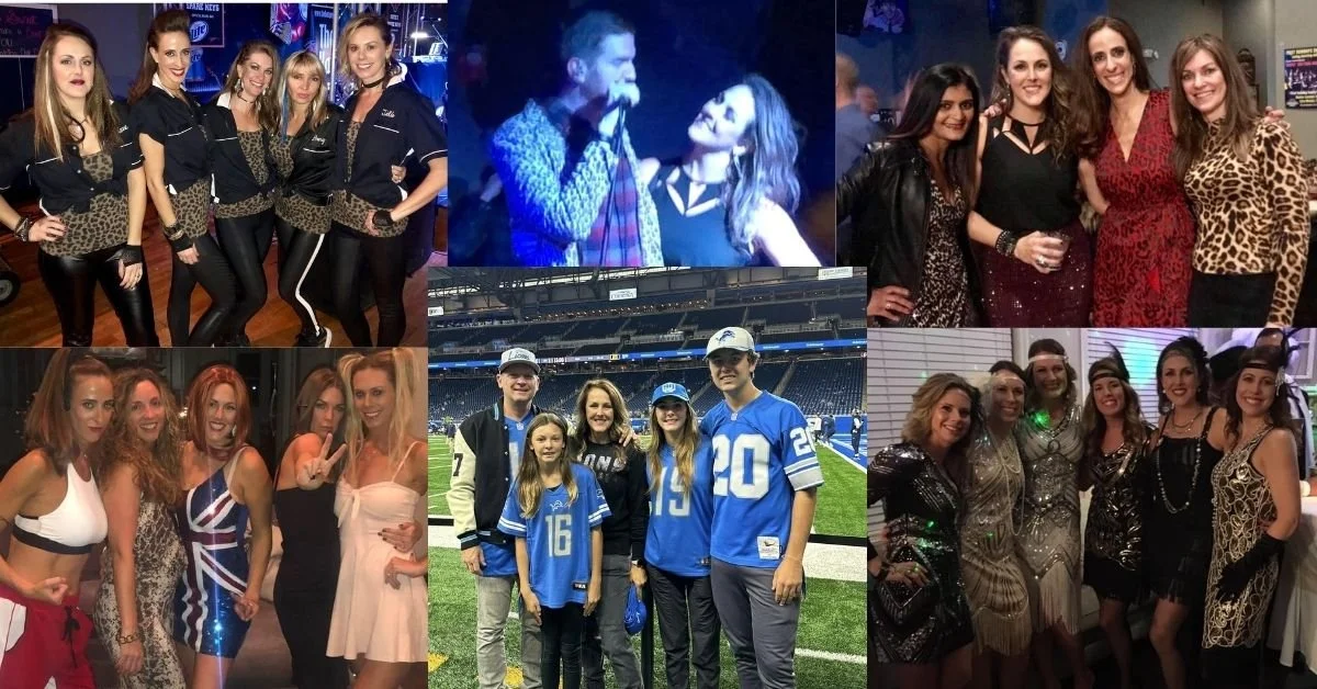
There are moments in life where emotional expression matters more than perfect color balance. A black leather jacket is iconic - thanks to Marlon Brando & James Dean firmly cementing it as a symbol of youthful rebellion and counterculture in the 1950’s, nothing hits the mark better for those looking to project rebellion, cool confidence, or a rock vibe. Originally born of function in the late 1800’s, a perfectly weathered pair of brown cowboy boots have become a timeless staple for a more rugged, boho or country-inspired ensemble on the runway and everywhere in between. Donning brightly colored festival wear just feels like it takes the celebration to another level. Being in a stadium, part of a sea of people clad in the same color spiritwear feels like community - one big, collective family coming together for the same cause - rooting on your favorite team.
There’s a reason people continue wearing pieces outside their palette:
The mood is right
The aesthetic is iconic
The clothing communicates something emotionally
The experience matters more than optimizing harmony
A Soft Summer may not technically glow in a jet-black moto jacket—but that doesn’t mean they should never wear one to a concert. A True Autumn may not have neon pink in their palette—but that electric color might feel perfect at a music festival. A Light Spring might love an edgy charcoal boot in the fall despite it being slightly too heavy for their coloring. I once had a client tell me she loved wearing a Tigger costume and neon orange eyeliner to raves and wondered how those choices would align with her newly-found Soft Autumn palette. The truth - they don’t align. Like, at all. But heading to a rave in your signature look is one of those times I say “color analysis be damned!” Style is allowed to have personality and you are permitted to step outside of your palette!
Color Analysis Should Support Self-Expression, Not Eliminate It
Sometimes people misunderstand color analysis as a strict set of fashion laws. The real purpose of knowing your best colors is awareness. Once you understand the “why,” you get to choose intentionally. Choosing with intention is very different from feeling boxed in or that you are expected to follow rigid rules. Pablo Picasso famously noted, "Learn the rules like a pro, so you can break them like an artist." The goal of knowing the rules first is to understand their underlying reason/purpose so you can “break” them as you see fit.
Knowing the “Rules” of personal color harmony allows you to understand how color affects you:
Why certain colors feel easier to wear
Why some shades constantly earn compliments
Why other colors feel draining or overpowering
How to create harmony when you want it
There’s a Difference Between Everyday Dressing and Statement Dressing
For many people, more closely following their personal palette is useful in making choices in a multitude of areas:
Everyday basics
Professional wardrobes
Makeup
Hair color
Special occasion outfits
Capsule wardrobes
These are the categories where color harmony tends to matter most because the goal is often to look polished, rested, approachable, elevated, or naturally radiant. But statement dressing for festival fashion, concert outfits, editorial looks, costumes, Avant-garde styling, streetwear or artistic expression can follow a different purpose. The Met Gala would be boring if too much harmony hit the red carpet. Similarly, sometimes a dress code or theme is suggested for special celebrations. I love leopard print. To me, it never goes out of style. Like, ever. At my 40th birthday party at a bar with a 90’s rock cover band, all of my friends surprised me and wore leopard print clothing pieces. One of my best guy friends even donned a leopard print blazer (which the lead singer of the band stole, as evidenced in the middle picture above). I never felt more seen, understood or celebrated! Occasions such as these or other celebratory moments in time are often about creating emotion, drama, playfulness, or identity—not necessarily visual harmony. Such times can make for some amazing memories!
You Don’t Have to Choose Between Style and Color Theory
One of the healthiest ways to approach color analysis is to see it as a foundation, NOT a limitation. Your personal color palette gives you some parameters to hone you in on when you want ease and simplicity:
A home base
A guide for balance
A shortcut for cohesion
A framework for shopping
However, you are still allowed to experiment. In fact, personal style often becomes more creative once you understand your palette because you learn how to “break” the rules (or come very near to doing so):
How far you can push contrast
Which “rule-breaking” colors still work near your face
How to balance an out-of-palette statement piece
When disharmony can actually create visual interest
Sometimes tension in an outfit is intentional. Sometimes the slightly too-dark eyeliner, overly bright sneaker, statement jewelry piece, bold lip color or dramatic black jacket is the point.
How to Stray From Your Palette Without Feeling Off
If you love a color outside your palette, there are ways to wear it more harmoniously should you desire closer harmony:
Keep it away from the face
Pair it with your best neutrals
Balance it with flattering makeup from your tone
Use it in accessories or shoes
Choose your ideal version of that color family
Add texture and styling that supports the mood
A summer who loves black may prefer softened charcoal leather over stark patent black, an autumn wanting bright color may choose warm saturated tones instead of icy neons, a winter wearing earthy tones may offset them with high contrast makeup or crisp styling. You do not need perfect adherence to still benefit from using color analysis principles in other aspects of your outfit.
EXPRESSING YOUR Personal Style Should Still Feel Fun
At the end of the day, fashion is not a math equation. You are not failing color analysis because you occasionally wear black. You are not “doing it wrong” because you love a bold festival outfit. You are not required to abandon every color outside your palette forever. We often have associations with colors that we like or dislike for reasons having nothing to do with color harmony. Feelings colors evoke can be powerful and sentimental. If you have had a signature favorite color you have always worn that isn’t in your palette? Wear it if it still feels authentically you!
Personal color analysis is simply a tool to help you understand how to work with (or against!) color harmony more intentionally. Once you understand harmony, you also gain the freedom to break it on purpose. Sometimes the goal is looking radiant. And sometimes the goal is feeling cool, expressive, artistic, powerful, rebellious, nostalgic, playful, or unforgettable.
When you understand color, you can make an educated choice in how you express yourself each day.
With warmth,
Renee Pawloski
TCI Certified Personal Color Analyst in Denver, Colorado
The POWER OF COLOR ANALYsIS in headshots
So, you've just booked an appointment for new headshots or a branding photoshoot? Now comes the planning! How do you achieve the most iconic pics that showcase you and what you do? I sat down with photographer Carrie Miller to learn more about branding photography. A picture really is worth a thousand words - make sure to carefully plan around your color story too. Read on for suggestions from Carrie for ways to get the best shots and ideas from me to leverage the power of color to make you look your very best.
When someone schedules a color analysis with me, they’re usually looking to refresh their wardrobe with more intentional clothing choices. They may be interested in finding flattering makeup or hair colors, or have an important event coming up they are preparing for and want to know their best colors to outfit them for the occasion.
Recently, I have had several clients come in because they have new headshots or a branding session booked and they want to know what colors they should wear to show up their best selves. They have cued in to one of the most important factors in a successful headshot - the color story. The perfect pose or killer backdrop won’t be as impactful if the colors you wear aren’t aligning with your personal coloring. Colors not in harmony with your personal coloring can make a headshot look artificial and forced quickly. When something feels off, we are less likely to trust that photo or that person.
After coaching my recent clients on color in preparation for their headshots, I sat down with the talented photographer Carrie Miller of Aspen Imagery to glean more tips for great shots from her perspective behind the lens.
HEADSHOTS: A PHOTOGRAPHER’s Perspective
What drew you to photography? I became interested in photography in high school when I joined the yearbook staff. I love the concept of telling people's stories in a way that doesn't necessarily require a lot of words.
What inspires you most as a photographer? I am inspired when I see people truly enjoying life and incorporating that into the everyday. For example, one of my favorite sessions was with a CEO who has a pottery business (in addition to his day job), solely because it brings him joy.
What is your best piece of advice to your clients to help them relax in front of the camera? My best piece of advice to clients is to try not focus on having to smile & don't force an expression. As I have a conversation and I get to know my clients, those special moments tend to sneak in and the end result is ideally how they see themselves and hope to be portrayed.
Are there colors, patterns, textures, or fabrics that are best to wear during a photo session or any such to avoid? I give each client a preparation guide and include things that are specific to them. A few general things to keep in mind are to avoid to following:
Distracting logos (unless it’s your brand)
Neon or overly bright colors
Wrinkled or ill-fitting clothes
Heavy stripes or tiny patterns (these typically don’t photograph well)
What ways do you have to showcase one's personality or brand during a photo shoot? A person's personality or brand can be showcased in a number of different ways during a photo shoot. Sometimes it looks like movement-I once had someone jumping on a couch. Sometimes it looks like props that match what they do for a career or an environmental background instead of a plain colored wall. One of my goals is to always help someone tell their story through their images. Getting to be a part of telling someone's story is one of my favorite things about branding photography.
How often do you suggest people refresh their headshots or branding photos? I suggest people refresh their headshots or branding photos every few years. If there are changes to the staff or people (especially the owner) have changed something drastic about their appearance, then a refresh will need to be done sooner.
You can find Carrie and her fabulous images at: www.aspenimagery.com or on IG @carrie_miller_photographer. Carrie is a total pro and has a gentle way to put even the most camera-shy humans at ease.
Read on for more ideas to leverage the power of color in your branding and headshots…
HEADSHOTS: A COLOR ANALYST’s PERSPECTIVE
Your Face Doesn’t Exist in Isolation
It is important to think about your messaging when planning your headshots or branding photos. In a professional headshot, your face is the focal point—but the colors around it are what determine whether you look vibrant, authoritative, approachable, or washed out.
During a color analysis, we take into account Hue, Value and Chroma to determine your best colors that support your natural color harmony, not compete with it. When the wrong colors show up in a headshot, subtle problems can appear: shadows under the eyes can look more pronounced, skin can look dull or uneven, or your face can lose definition. When the right colors are used, the opposite happens: the skin looks clearer, the eyes appear brighter, and the entire image feels more polished. Often, the viewer cannot pinpoint why a headshot is a show-stopper or why it feels off.
The Most Common Headshot Mistake
The biggest mistake I see is people choosing a headshot outfit based on what feels “professional” rather than what is harmonious with regard to color. Anything goes in modern headshot photography. You do not have to don a black blazer and white blouse to come across as professional. Contrary to popular belief, black does not look best on everyone. It really only truly harmonizes with individuals in the winter tones who have a cool or cool-neutral undertone and high-contrast coloring. For many people, wearing black can be harsh and overpowering, pulling attention away their your face.
Backgrounds Matter Too
The background color in your photos is just as important as the colors in your clothing. A background that sits outside your most harmonious colors can create subtle visual tension in the photo. Conversely, when the background colors complement your color palette, the image feels pleasing, cohesive and effortless. The goal isn’t to match the background exactly—it’s to create visual harmony.
Some examples:
Individuals in the soft palettes often photograph beautifully against soft muted colors in creams, dusty blues, grey greens, blue-greens, or gentle grays
Individuals in the bright palettes can stand out against crisp white, bold navy, or other highly saturated colors due to their high-contrast coloring
Warm complexions glow against earthy or golden (yellow) based backgrounds
Cool complexions look best in cooler blue-based backgrounds
Makeup and Color Balance In PHOTOS
During a color analysis, we address how to choose makeup that works best with your natural coloring. Your fandeck can be used directly to choose lipstick, cheek color, eyeshadow and eyeliner. Wearing harmonious makeup in your headshots is another piece in the puzzle. Your makeup should support and enhance your natural coloring, not fight against it. While it may be suggested to apply makeup a bit heavier to show up better in your photos (check with your individual photographer on this one - it will depend on the location and lighting they plan to use), you will always look best in harmonious colors. This is not the time to stray far from your palette, no matter how tempting a “statement lip” may be.
Common issues that fight against color harmony I have seen in the past - cool toned individuals wearing warm bronzer, lip colors that are too dark in value or too bright in chroma, or highlighter that appears off and is distracting on darker valued tones. When makeup aligns with someone’s color harmony, everything about the person’s face feels more natural. Color harmony sends a message of ease and comfort. The lack of color harmony can cause the opposite effect and subconsciously evoke negative feelings or feelings of mistrust.
The Goal: Let the Person Be the Focus
A successful headshot doesn’t make people think about the color of your clothing, the background color, or the styling choices you and the photographer made. A successful headshot makes the viewer focus on you. The right colors quietly do their job: they reflect the skin’s vitality, support the natural tones of the face, and create visual balance so that expression and personality come forward.
During my color analysis sessions, I often tell clients that the best colors make people say “You look great today,” not “That’s a great color on you.” The same principle applies to headshots. When all of the colors are right, the photograph stops being about its parts and pieces—and instead, becomes about your natural, authentic presence oozing off the page or screen. When you show up your best in a photo, you project confidence, trustworthiness and authority. Leverage the power of color for your next headshot or branding photos session. The power of visual communication grabs attention and can foster immediate understanding and trust. A picture is really worth a thousand words, which can lead to a thousand clients (or that next promotion or dream job)!
With warmth,
Renee Pawloski
TCI Certified Personal Color Analyst in Denver, Colorado

HOW TO EMBRACE YOUR COLOR PALETTE AFTER YOUR COLOR ANALYSIS
So, you've just left your TCI personal color analysis appointment—congratulations! You now know the neutrals and colors that best compliment your unique combination of skin, hair, and eye color.
But what comes next? How do you actually use your beautiful new True Colour International palette in your daily life? How can you incorporate your new colors without feeling overwhelmed or like you need to replace everything in your wardrobe?
Read on for 5 steps to help integrate your personal colors with ease and confidence.
By: Renee Pawloski
So, you've just left your TCI personal color analysis appointment—congratulations! You now know the neutrals and colors that best compliment your unique combination of skin, hair, and eye color. Whether you’ve discovered you’re a True Autumn, a Soft Summer, or a Dark Winter, this is the beginning of a transformative journey embracing your natural color harmony in how you present yourself to the world.
But what comes next? How do you actually use your beautiful new True Colour International palette in your daily life? How can you incorporate your new colors without feeling overwhelmed or like you need to replace everything in your wardrobe?
Here’s a step-by-step guide to help integrate your personal colors with ease and confidence.
1. Start with STUDYING YOUR Swatch Book
Your palette swatch book is your new best friend. Keep it with you and swatch everything around you—especially when shopping. The more you use it, the better you will become at spotting harmony or disharmony. Understanding color is all about comparison. Taking your swatchbook to a second hand store that sorts items according to color can offer an opportunity to see dozens of one-off versions of a color all at once and can be a great exercise in training your brain to start thinking in the color terms of hue, value and chroma when comparing the different versions.
Using your swatchbook isn’t always about matching items exactly, it is about using it as a tool to help you identify colors that harmonize with the three dimensions of your natural coloring. Think of it as a compass, not a strict rulebook. First look to see if there is a close match in your fandeck. If you can’t find one, check the color against your color combination strip to see if it appears to harmonize with those 15 colors. You know you are on the right track if it appears to share the same hue, value and chroma as the colors in your fandeck.
2. SHOP Your Closet with YOUR NEW COLOR KNOWLEDGE
Now that you have seen colors with your own eyes that harmonize with your coloring during your color draping (and those that don’t flatter you), begin by assessing and organizing your existing wardrobe:
Put pieces that match your palette front and center in your closet. Often clients discover that some of their favorite items are already aligned with their colors.
Set aside items that clash or feel “off.” Don’t dismiss these items right away, but notice how you feel wearing them versus wearing the colors from your newly discovered palette. In time, you may find yourself reaching for the non-harmonious pieces less and less.
Hang on to favorites. Love your favorite blouse but dismayed to have discovered fuchsia isn’t in your palette? Wear it! Your color palette is a tool, not a rule. Use accessories or layer items in colors from your palette to help add some harmony to a favorite item not aligned with your palette. Example: Throw on a pair of gold hoops with your fuchsia blouse to add warmth if you are warm or warm-neutral in undertone.
You’re not purging or acting in haste—you’re prioritizing with a measured approach!
3. Focus on Building OUT YOUR Wardrobe with INTENTION
Every palette includes a range of flattering neutrals and accent colors. Use your neutrals as the workhorses of your wardrobe—your go-to shades for pants, jackets, suits and leather goods. Invest in quality pieces in your neutrals to create a foundation that mixes effortlessly with the accent colors in your palette. Use your “colors” for tops, blouses, jewelry, accessories, makeup & eyeglasses. If diving into “color” feels intimidating, or the colors in your palette are colors that are new to you, try starting with one or two of the colors that speak to you. Start with a top as a low-cost investment to dip your toe in the water, or shop at a second hand store to test drive a few new colors in pieces at lower price points. Choose one of the colors that made your eyes sparkle during the analysis.
Examples:
A Green Eyed Soft Autumn might build around warm taupes, cream/bone, and soft camels for their neutrals and try a top in a soft pine green, a soft olive or a warm plum mauve
A Blue Eyed Bright Winter might lean into charcoal, white, navy, and true black for their neutrals and try a top in a bright cobalt blue, a bright teal or a bright blue-purple
4. Update Your Makeup Bag
Choosing makeup from your palette is one of the quickest and most impactful ways to bring your palette to life and color harmony to your look.
If you don’t already have makeup in your palette, consider adding the following:
Lipsticks from your palette’s “reds” section (your “reds” may be pinks, berries, mauves, reds, bricks, corals, salmons, peaches, magentas, etc, depending on your palette) - you may want to eventually try two or three shades in varying values to give yourself a range of color. Experiment with different application methods to get different looks out of the same product - use with or without a lip liner, apply a gloss over the color, or apply with a brush versus slicking it on straight from the tube
Blushes from your palette’s “reds” section that mimic your natural flush
Neutral eyeshadows from your palette’s neutrals that enhance your eye color without overpowering
Accent colors from your palette for a more colorful eyeshadow or liner
Many clients notice they look more refreshed and radiant with just a few subtle makeup switches.
5. Be Kind to Yourself—It’s a Process
As I tell my clients at their analysis appointments, learning to look at colors and evaluating them with regard to hue, value & chroma is not difficult, it just takes practice. Adopting your color palette isn’t a one-day overhaul. It's a journey of discovering what truly enhances you and letting go of things that don’t serve you anymore.
Celebrate the wins along the way:
A compliment on a new blouse
Noticing your eyes take center stage in colors with the right hue, value & chroma
Feeling more confident and put-together
Final Thoughts
When in doubt, reach out. If you are struggling applying your palette to your life, your color analyst is a resource even after your appointment. If you’re unsure how to coordinate your colors, shop for a special event, or need advice on makeup, don’t hesitate to ask specific questions or reach out for support. Some analysts offer follow-up consultations, closet audits, or personalized shopping help.
Color is a powerful tool—it tells your story before you say a word. Now that you know your personal palette, you’re equipped to harness the power of color to make more confident, intentional choices in how you present yourself to the world.
And trust me, once you start living in your best colors, and seeing the power of personal color harmony, you won’t want to go back!
💌 colorsavvystudio@gmail.com | IG: colorsavvystudio |

Color SAVVY EDIT – A New Blog About Personal Color Harmony
Welcome color lovers! I’m starting a blog as a place to share some tips and ideas to help you incorporate color harmony into your life. Follow along to become more color savvy!
By: Renee Pawloski
Hello and welcome!
This is the very first post in what will be an occasional (but lovingly crafted!) blog dedicated to personal color harmony—how you can bring more ease, beauty, and confidence into your life by understanding the colors that are uniquely yours.
Whether you’re already familiar with personal color analysis or just color-curious, my hope is that this space becomes a helpful, encouraging place for you to learn, explore, and feel empowered to express yourself through color. Whether you've had a personal color analysis draping or just love color, you're in the right place.
What IS Personal Color Harmony?
It’s all about wearing colors that align with your natural features—your skin tone, eye color, and hair color—to bring out your most radiant, balanced self. The right colors don’t just make your outfit look good—they make you shine.
Why This Blog?
After working with my many amazing clients, I realized the most common question after an analysis is:
“How do I actually start using my palette?”
This blog will offer answers—bite-sized tips, style ideas, and encouragement for building a wardrobe and makeup routine that reflects both your personal color harmony and your personality.
Let’s Start Small
Want a quick win after discovering your colors? Try swapping one item near your face (like a top or a lipstick) for something in your palette. You'll be surprised how much difference it makes.
Thanks for reading, and stay tuned for more posts soon. I’m so glad you’re here!
With warmth,
Renee Pawloski
TCI Certified Personal Color Analyst in Denver, Colorado
📧 colorsavvvystudio@gmail.com | 📸 colorsavvystudio |